PanelHeader
Reusable PanelHeader component
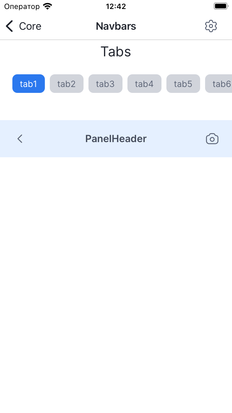
Example
import {
  createStyles,
  PanelHeader,
  SimpleIcon,
  useStyles,
} from '@lad-tech/mobydick-core';

export const PanelHeaderWidget = () => {
  const [styles] = useStyles(stylesFn);

  return (
    <PanelHeader
      title={'PanelHeader'}
      leftView={<SimpleIcon name={'icon-arrow-left'} />}
      rightView={<SimpleIcon name={'icon-camera'} />}
      containerStyle={styles.container}
    />
  );
};

const stylesFn = createStyles(({colors}) => ({
  container: {
    backgroundColor: colors.BgAccent,
  },
}));
Props
title
| TYPE |
|---|
| string |
Title for PanelHeader
subtitle
| TYPE |
|---|
| string |
Subtitle for PanelHeader
titleView
| TYPE |
|---|
| ReactNode |
TitleView for PanelHeader
titleStyle
| TYPE |
|---|
| TextStyle |
Custom styles for PanelHeader title
titleFont
| Type | DEFAULT |
|---|---|
| TypographyProp | SemiBold-Secondary-M |
Font for title
subtitleStyle
| TYPE |
|---|
| TextStyle |
Custom styles for PanelHeader subtitle
subtitleFont
| Type | DEFAULT |
|---|---|
| TypographyProp | Regular-Tertiary-XXS |
Font for subtitle
titleViewStyle
| TYPE |
|---|
| ViewStyle |
Custom styles for title
rightView
| TYPE |
|---|
| ReactNode |
RightView for PanelHeader
leftView
| TYPE |
|---|
| ReactNode |
LeftView for PanelHeader
rightViewStyle
| TYPE |
|---|
| ViewStyle |
Custom styles for rightView
leftViewStyle
| TYPE |
|---|
| ViewStyle |
Custom styles for leftView
containerStyle
| TYPE |
|---|
| ViewStyle |
Custom styles container for contentHeader
commonViewStyle
| TYPE |
|---|
| ViewStyle |
Custom styles container for panelHeader
isSafeAreaView
| TYPE |
|---|
| boolean |
Flag for using SafeAreaView
edges
| TYPE |
|---|
| Edge |
Sets the edges to apply the safe area insets to.