Counter
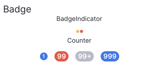
Reusable Counter component
Example
import {
  View,
} from '@lad-tech/mobydick-core';

export const BadgeWidget = () => {

  return (
      <View>
        <Counter
          size={ICounterSize.small}
          type={ICounterTypes.accent}
          count={1}
        />
        <Counter type={ICounterTypes.attention} count={99} />
        <Counter type={ICounterTypes.muted} count={999} />
        <Counter type={ICounterTypes.accent} count={999} maxLength={3} />
      </View>
  );
};
Props
count
| TYPE |
|---|
| number |
Number for counter
type
| TYPE | DEFAULT |
|---|---|
| ICounterTypes | ICounterTypes.accent |
Predefined type for counter
size
| TYPE | DEFAULT |
|---|---|
| ICounterSize | ICounterSize.medium |
Predefined size for counter
style
| TYPE |
|---|
| ViewStyle |
Custom styles for counter
maxLength
| TYPE | DEFAULT |
|---|---|
| number | 2 |
Maximum number length
font
| Type | DEFAULT |
|---|---|
| TypographyProp | 'Regular-Primary-S' |
Font for text