Item
Reusable Item component for ActionSheetBase
Example
import {
ActionSheetBase,
Button,
IItemType,
Typography,
usePopups,
View,
} from '@lad-tech/mobydick-core';
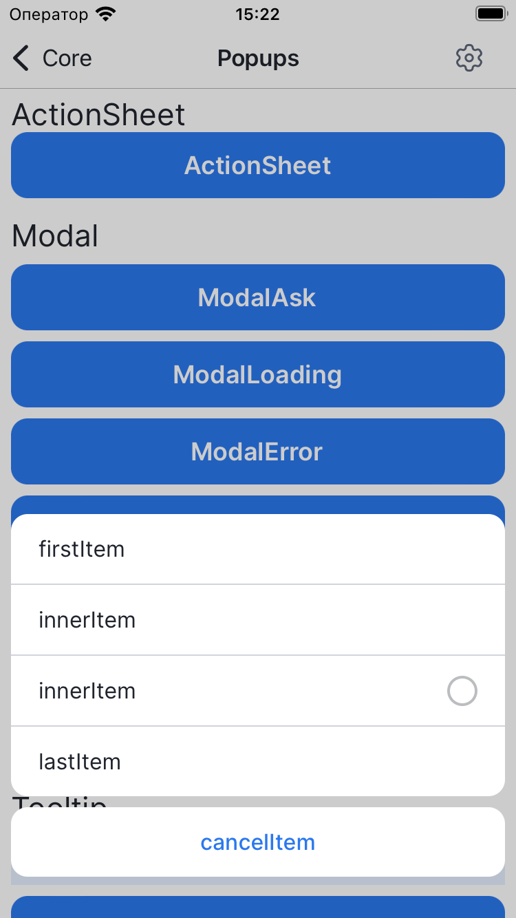
export const ActionSheetWidget = () => {
const {openPopup} = usePopups();
return (
<View>
<Typography font={'Regular-Primary-H5'}>ActionSheet</Typography>
<Button
text={'ActionSheet'}
onPress={() =>
openPopup({
Content: props => (
<ActionSheetBase {...props}>
<ActionSheetBase.Item
title={'firstItem'}
itemType={IItemType.firstItem}
onPress={props.onClose}
/>
<ActionSheetBase.Item
title={'innerItem'}
itemType={IItemType.innerItem}
onPress={props.onClose}
/>
<ActionSheetBase.Item
title={'innerItem'}
radio={'radio'}
itemType={IItemType.innerItem}
onPress={props.onClose}
/>
<ActionSheetBase.Item
title={'lastItem'}
itemType={IItemType.lastItem}
onPress={props.onClose}
/>
<ActionSheetBase.Item
title={'cancelItem'}
itemType={IItemType.cancelItem}
onPress={props.onClose}
/>
</ActionSheetBase>
),
})
}
/>
</View>
);
};
Props
style
| TYPE |
|---|
| ViewStyle |
Custom styles for Item
Requiredtitle
| TYPE |
|---|
| string |
Title for Item
textFont
| Type | DEFAULT |
|---|---|
| TypographyProp | 'Regular-Primary-M' |
Font for title
leftIcon
| TYPE |
|---|
| ReactElement |
Left icon for item
onPress
| TYPE |
|---|
| () => void |
OnPress for item
radio
| TYPE |
|---|
| string |
Title for radio
checkboxList
| TYPE |
|---|
| string[] |
Titles for checkboxList
disabled
| TYPE |
|---|
| boolean |
Disabled for onPress
itemType
| TYPE |
|---|
| IItemType |
Type for Item